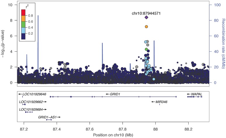
Figure 1.
Regional association plot for GRID1 and 200 kb flanking regions, implemented using LocusZoom (Pruim et al., 2010). The most significant marker is in purple (rs11201929, p = 4.11e-09, q = 0.06 for Maxdrinks). Linkage disequilibrium information is based on the 1000 Genomes AFR super-population. The size of the points representing plotted SNPs corresponds to the meta-analysis sample size.

