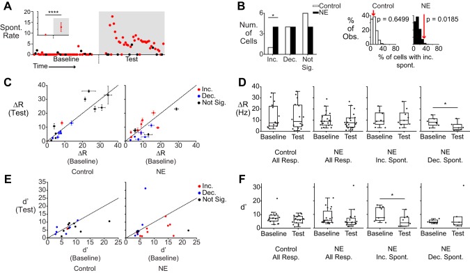
Fig. 2.
Spontaneous activity is increased in a subpopulation of AOB neurons. A: scatter plot of spontaneous activity in an AOB neuron that showed increased spontaneous activity (Spont. Rate) in the NE period (****P = 1.25 × 10⁻¹⁶). Red circles indicate the unstimulated firing rate (measured just before a stimulus onset). Black circles indicate firing rate measurements that happened to follow strong stimulus responses (which may not fully recover to baseline before the subsequent trial). Inset shows the mean and SD of the measured spontaneous rate for this cell. B: the number of cells in control (n = 11) and NE-treated (n = 12) conditions that exhibited significantly changed or unchanged spontaneous activity (Num., number; Inc., increased; Dec., decreased; Not Sig., no change). There were significantly more cells that exhibited increased spontaneous activity (P = 0.0185 compared with a shuffled population). At right are histograms relating the observed prevalence (% Obs.) of spontaneous rate increases (red arrows) to shuffle test expectations (which are based on control recordings). C: scatter plot of stimulus-evoked ΔR, with changes in spontaneous activity indicated by color (blue, decreased; red, increased; black, no change). Error bars represent SE. D: box plots showing mean stimulus responses (Resp.) for control and NE-exposed cells (left 2 graphs), and breakdowns based on spontaneous activity changes (right 2 graphs). *P = 0.01 (paired Student’s t-test). E: scatter plots of the sensitivity index (d′) for control (n = 16) and NE-treated (n = 19) conditions. Colors reflect the same parameters as C. F: box plots showing d′ values for all stimuli in control and NE-treated conditions, broken down by categories as in D. *P = 0.0133 (paired Student’s t-test).

