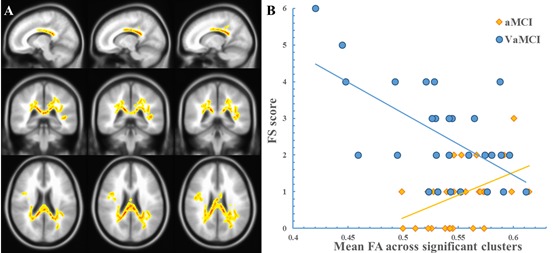
Figure 2. The “FA × Group” interaction effect on the FS score.

The clusters showing a significant “FA × group” effect are indicated in a yellow-to-red color. The color represents the F statistic for this interaction. The scatterplot was drawn using the average FA value of the cluster. Panel A, the region with a significant “FA × group” effect. Panel B, the scatterplot.
