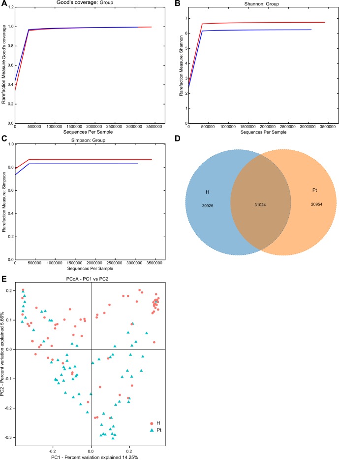
Figure 1. Structural comparison of urinary microbiota between two cohorts.
A. The Good’s coverage was used to assess sequencing depth. B. and C. The Shannon and Simpson Rarefaction curves were applied to estimate diversity. D. Venn diagram demonstrating overlap of OTUs in the urinary microbiota between the two cohorts. E. Principal coordinate analysis plot of the urinary microbiota based on the unweighted UniFrac metric. Red and blue lines and dots represent healthy controls and T2DM patients, respectively. H and Pt stand for healthy controls and T2DM patients, respectively.

