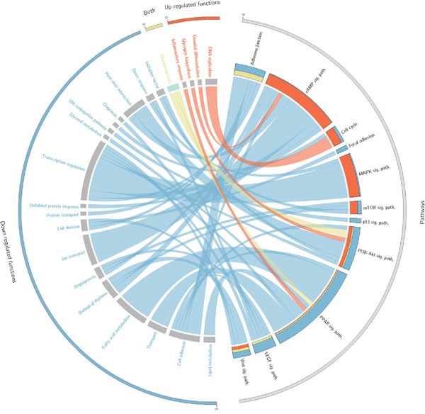
Figure 2. Circos plot that summarises the relationships between effectors within pathways and the functions triggered by them.

Only cancer KEGG pathways (Table 3) related to functions significantly related to survival are represented here. On the right side appear the effector circuits grouped according to the pathway they belong to. There is a histogram per pathway that represents the proportion of effector pathways upregulated (red), downregulated (blue) and dysregulated in both directions (yellow). On the left side of the circo appear the functions triggered by the effector circuits divided into those which are significant when are up-regulated (red), when are down-regulated (blue) or when both situations occur (yellow). For each function there is a band that indicates the prognostic of its deregulation, which can be good (green) or bad (grey).
