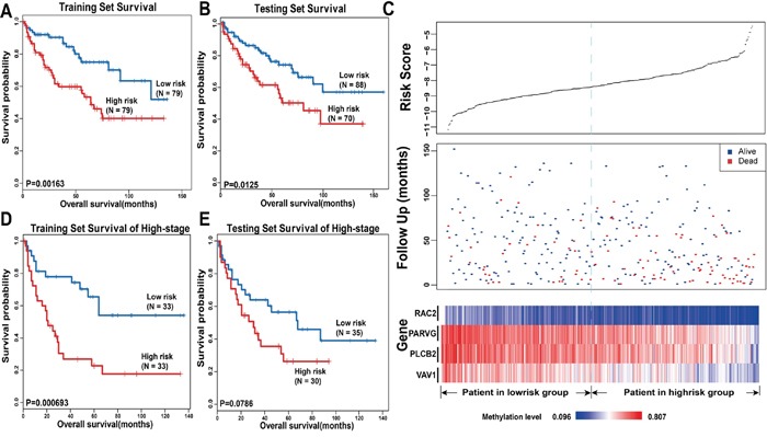
Figure 5. Survival analysis in KIRC.

The Kaplan-Meier plots show overall survival in high-risk group (red) and low-risk group (blue). The P-value was calculated by log-rank test. Overall survival was indicated in months. A. The Kaplan-Meier plots in training set. B. The Kaplan-Meier plots in testing set. C. The upper panel shows the risk score distribution of all samples that contains both in the training set and testing set. The middle panel shows the status of patients, where red plots represent that patients were dead and blue plots represent patients were alive. The bottom panel is the color-gram of gene methylation value. Rows represent genes and columns represent patients. The black dotted line represents the median methylation signature cutoff dividing patients into high-risk and low-risk groups. D. The Kaplan-Meier plots of patients in training set of late stage. E. The Kaplan-Meier plots of patients in late stage in testing set.
