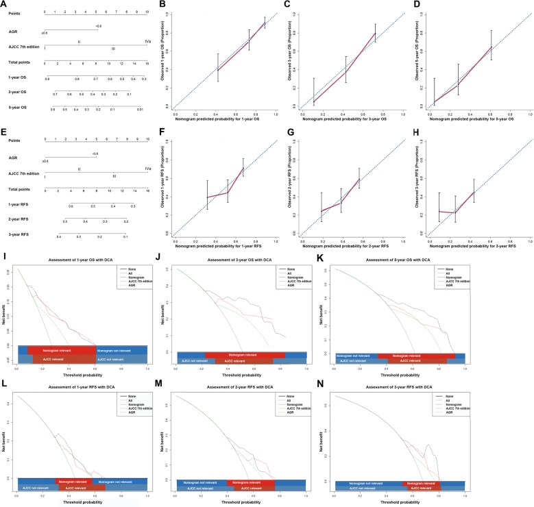
Figure 3. ICC prognostic nomograms, calibration curves and decision curve analysis.
Nomograms predicting (A) OS and (E) RFS in patients with ICC (to use the nomogram, an individual patient's value is located on each variable axis, and a line is drawn upwards to determine the number of points received for each variable value. The sum of these numbers is located on the Total Points axis, and a line is drawn downwards to the survival axes to determine the likelihood of 1-, 3- and 5-year OS. The calibration curves for predicting OS at (B) 1 years, (C) 3 years and (D) 5 years; predicting RFS at (F) 1 years, (G) 2 years and (H) 3 years. Nomogram-predicted probability of overall survival is plotted on the x axis and actual overall survival is plotted on the y axis. Decision curve analyses depict the clinical net benefit in pairwise comparisons across the different models. Nomogram is compared with the the AJCC 7th edition in terms of (I) 1-, (J) 3- and (K) 5-year OS and (L) 1-, (M) 2- and (N) 3-year RFS. Dashed lines indicate the net benefit of the predictive models across a range of threshold probabilities (black: nomogram; red: TNM stage; green: AGR). The horizontal solid black line represents the assumptions that no patient will experience the event, and the solid grey line represents the assumption that all patients will experience the event. On decision curve analysis, the nomograms showed superior net benefit compared with AJCC 7th edition across a wider range of threshold probabilities.

