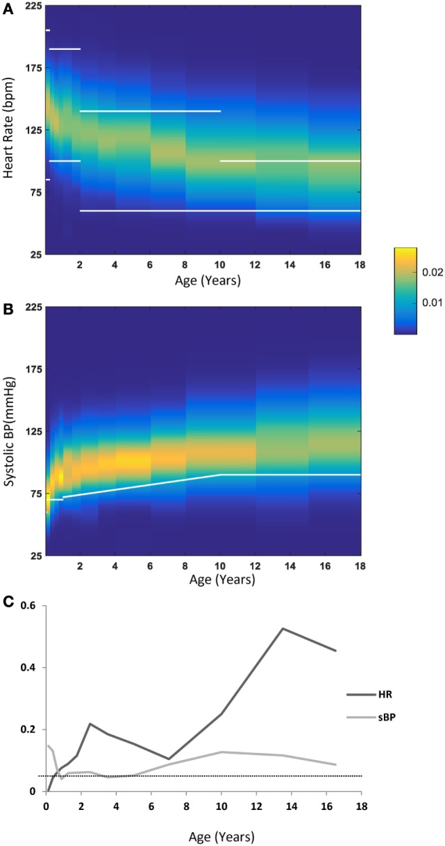
Figure 4.

(A) Heart rate (HR) distribution by age—each vertical band represents one age group, with the probability of each HR value coded by the color map detailed in the legend. Overlaid in white lines are the cutoff ranges as published in the PALS guidelines. (B) Systolic blood pressure (sBP) distributions by age with a similar representation scheme as in (A). Overlaid in a white line are the lower cutoff values as published in the PALS guidelines. (C) The fraction of values outside (below or above) the PALS suggested cutoff ranges for HR (dark gray) or below the PALS suggested cutoff for sBP (light gray). The dotted line marks the 0.05 line.
