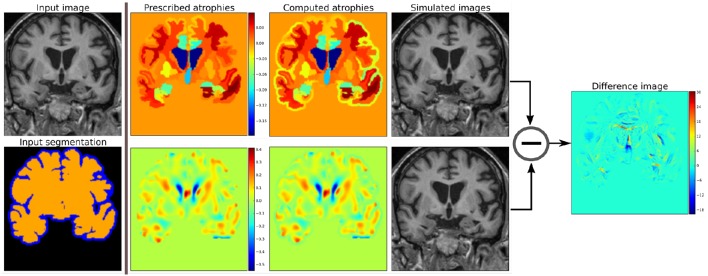
Figure 2.
Examples of two different kinds of atrophy maps. The first row prescribes an atrophy map that is uniform in different regions of the brain, while the second row prescribes a smoothly varying atrophy. Both of these atrophy maps have same average values in each ROIs. The example also shows that we can prescribe volume changes in ventricles, if desired, by adapting the input segmentation map accordingly. The simulated images, as shown, are different although they have same mean regional atrophy values. The prescribed atrophy maps and the corresponding computed atrophy maps have different values of atrophy in the regions with sulcal CSF because it is part of Label1 (blue color in the segmentation map) where the volume is allowed to freely change.

