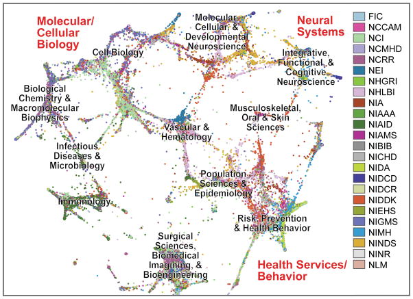
Figure 1. Graphically clustered NIH grants, as rendered from a screenshot of the NIHMaps user interface.
NIH awards (here showing grants from 2010; ~80,000 documents) were scored for their overall topic and word similarity, and the resulting document distance calculations were used to seed a graphing algorithm. Grants are represented as dots, color-coded by NIH Institute and are clustered based on shared thematic content. For acronyms and separate views with each Institute highlighted, see the legend for Supplementary Table 1. Labels in black were automatically derived from review assignments of the underlying documents. Labels in red indicate a global structure that was reproducible using multiple different algorithm settings.

