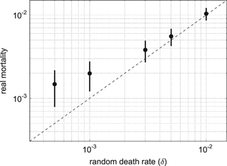
Figure 5.
Comparison of the real mortality rates between simulations with different random death probabilities (turbulence level was T=0.25 for all runs). Dots represent a mean value for each model run calculated after the system has stabilized, the bars show the s.d. Dashed line is the equality line where all mortality is explained by the random death factor δ. Both axes are in the logarithmic scale. As the probability of random death increases, it becomes the dominant source of mortality in populations.

