
Fig. 4.
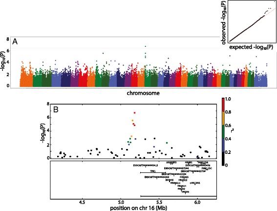
a Manhattan plot of genome wide association study of PC3. Marker position across the chromosome is plotted on the X axis against -log10(P) on the Y axis. The Bonferroni adjusted genome wide threshold is the solid red line drawn across the plot. QQ plot of expected versus observed –log10(P) is also shown as insert. b Manhattan plot of 2mb region surrounding the associated SNP. Colors of dots indicate the amount of linkage disequilibrium (as measured by r2) with the associated SNP