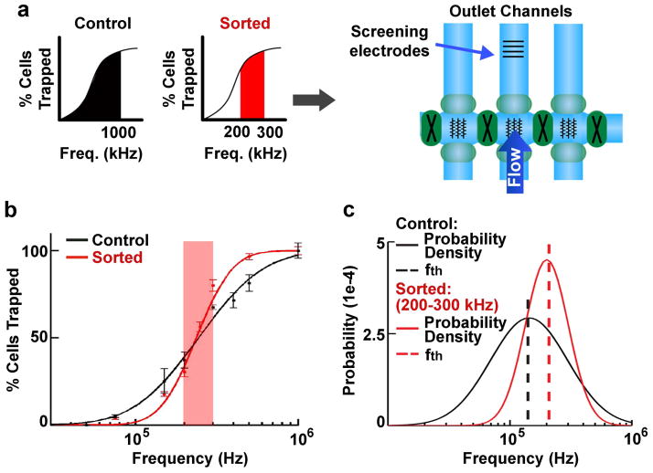
Figure 2. Increased purity of cells separated by DACS.
a) Cells were either unsorted control (entire frequency band 0–1000 kHz, black) or sorted (200–300 kHz frequency band, red) cells as depicted by graphs in the left panel. Both sets of cells were analyzed by screening electrodes in an outlet channel (right schematic). Cells were sorted in all 3 vertical channels at the same frequencies to improve yield and were screened in the middle channel.
b) Unsorted control (0–1000 kHz, black) and sorted cells (200–300 kHz, red) reveal distinct trapping curves (points are measured data and lines are fitted lognormal distributions)(17). The 200–300 kHz frequency range is indicated by red shading to highlight the steeper slope of the sorted cell trapping curve in this range than the control cell trapping curve, indicating greater purity of the sorted cells.
c) Log-normal distribution fitting of the trapping curves from (b) gives the resulting probability density functions (solid lines) for unsorted control (black) and sorted (red) cells. The most common trapping frequency for the population, the threshold frequency (fth, dashed lines) falls within the frequency band limits for the screened population (either 0–1000 kHz or 200–300 kHz) illustrating fidelity, while the peak height and shape (skewness) reflects the higher homogeneity of the sorted cells.

