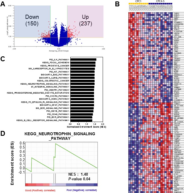
Figure 3. Gene set enrichment analysis of the differentially expressed gene signatures in the CA patients.

A. Volcano plot representation of differentially expressed gene signatures between Good (CPC 1) and Poor (CPC 4-5) cohorts. The number of differentially expressed genes was depicted in the blue and red box. B. GSEA corresponding heat map images of the enrichment of the CPC category. Genes in heat maps are shown in rows; a sample is provided in one column. Expression levels are represented as a gradient from high (red) to low (blue). C. The bar chart of 21 gene set lists of less than nominal p-value 0.05. D. GSEA enrichment plots of KEGG_NEUROTROPHIN_SIGNALING_PATHWAY enriched to neurological outcome is shown; the barcode indicates gene positions. The y-axis indicates the extent of enrichment.
