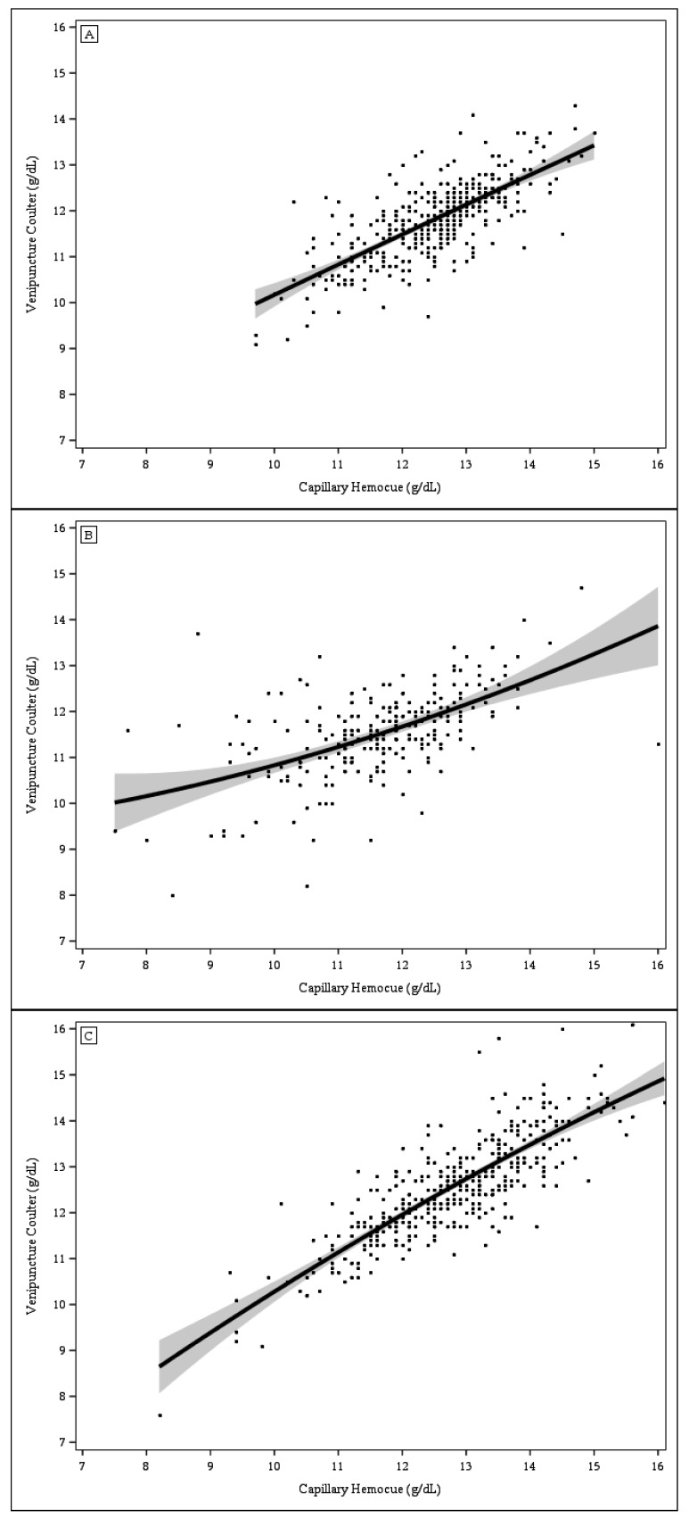
Figure 2.
Scatter plots of hemoglobin concentration from capillary blood analyzed with HemoCue vs. venous blood analyzed with Coulter Counter. The solid line represents the mean regression line and the grey areas represent the 95% confidence limits. (A) Kansas City (n = 413); (B) St. Louis (n = 213); and (C) Cleveland (n = 397).

