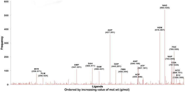
Figure 2. An illustration of ligand associations for Mtb pocketome.
Distribution of different ligand hits obtained for the predicted pockets in the proteome. The ligands are ordered by their molecular weights. The frequency on the Y-axis indicates the number of occurrences of the binding site of that ligand in the Mtb pocketome. This spectrum is qualitatively equivalent to the mass spectrum of the Mtb metabolome for unit protein abundances.

