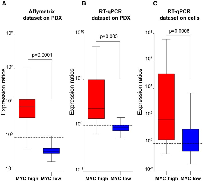
Figure 3. Validation of the MYC signature.

-
A–CBox plots representing normalized expression ratios (A) from transcriptomic data as in Fig 2D for four PDX of each group (MYC‐high and MYC‐low), (B) by RT–qPCR for the same PDX as in (A), and (C) by RT–qPCR for the same eight PDX‐derived primary cell cultures. The dotted line indicates the threshold 1 that differentiates between MYC‐high and MYC‐low profiles. The line in the box‐plot representation shows the median value of mRNA expression ratios, the lower and upper limits of each box represents the first and third quartiles, respectively. Whiskers represent the limits of extreme measurements (Mann–Whitney t‐test).
Source data are available online for this figure.
