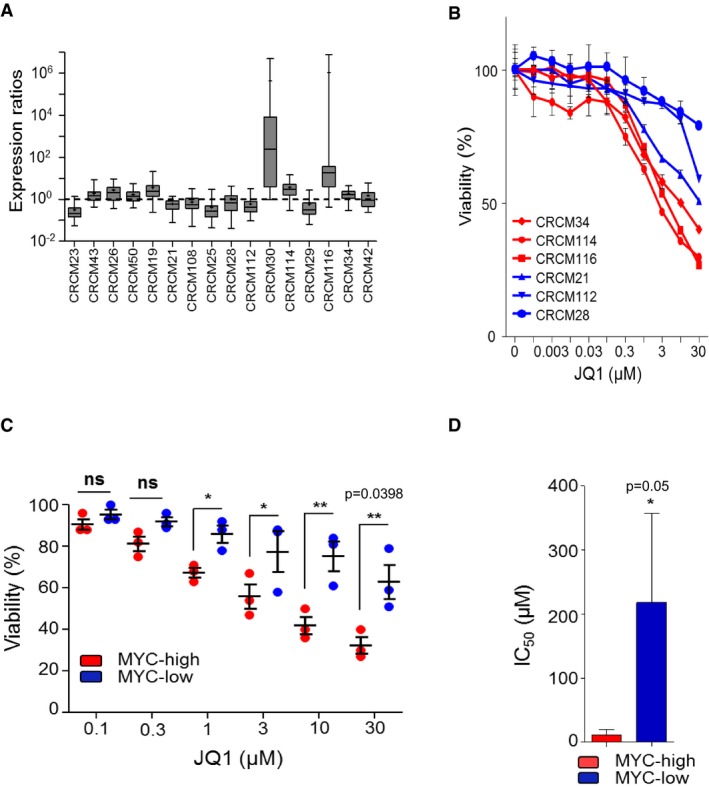
Figure 5. Verification in a validation cohort.

- Box plots representing normalized expression ratios for the MYC signature in 16 new PDX used as validation or test cohort. The line in the box‐plot representation shows the median value of mRNA expression ratios; the lower and upper limits of each box represent the first and third quartiles, respectively. Whiskers represent the limits of extreme measurements. qPCR in duplicate for each PDX.
- Chemograms for eight PDX‐derived cell lines with MYC‐high (red) or MYC‐low (blue) profiles were subjected to JQ1 treatment as in Fig 4A. Cell viability is indicated as % of the control (vehicle treated). Error bars represent SEM; n = 3.
- Graph representing JQ1 sensitivity for the six highest concentrations used in chemograms. Horizontal lines represent the median ± SEM (*P = 0.014; **P = 0.0398, Welch's t‐test).
- Histograms representing IC50 for JQ1 for the three MYC‐high and the three MYC‐low cell lines taken from the validation cohort (mean ± SEM, unpaired t‐test with Welch's correction).
Source data are available online for this figure.
