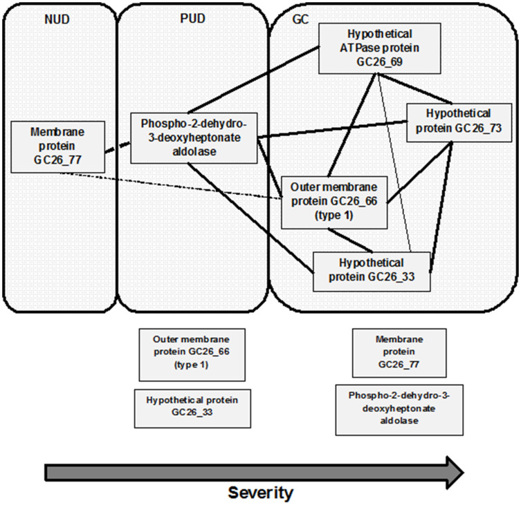
Figure 3. Correlation map of candidate genes with disease states and between genes.
The correlation was determined by Pearson's correlation (Table 5). Dotted line represents negative correlation and full line represents positive correlation. Bold line represents strong correlation with significance <0.01 and fine line represents correlation with significance <0.05. Genes outside the boxes represent genes present in the respective disease strains (Student's t-test) but no significant correlation with respective disease status (Pearson's).

