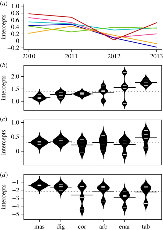
Figure 2.

Comparison of temporal variation in mean, maximum, median and minimum growth. (a) OLS estimates of intercepts for the best model as per table 1, for each year and each morphological group. The red line represents tabular colonies, orange arborescent, green massive, turquoise digitate, blue corymbose and pink encrusting arborescent. (b–d) Intercepts across years for the (b) 95th, (c) 50th and (d) 5th quantile regressions of size at time t as a function of size at time t − 1 and morphological group (as per the best model in table 1). Estimates are plotted as white lines in the centre of each black polygon, which represents a normal density curve around the estimates and is intercepted by a black line representing the mean for each morphological group. The dotted line represents the mean across all morphological groups. mas, massive; dig, digitate; cor, corymbose; arb, arborescent; enar, encrusting arborescent; tab, tabular.
