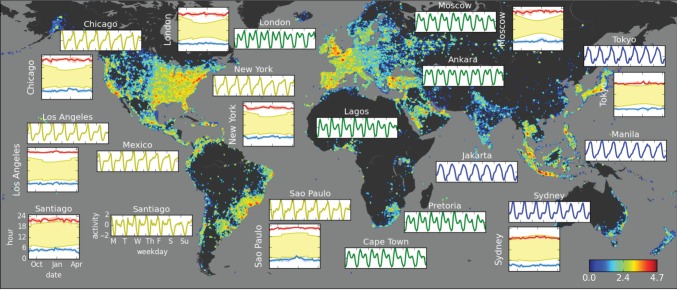
Figure 1.
Global Twitter activity. Background map: Twitter activity in each 0.25° × 0.25° geographical area (base-10 log scale at lower right). Rectangular insets: Average week of Twitter activity of selected cities in Universal Time (UTC) after subtracting the mean and normalizing by the standard deviation. Square insets: low (blue) and high (red) points of Twitter activity of several urban areas compared with daily sunlight periods (yellow) during the nine-month observation period (scales on lower left shown for Santiago are the same for all cities). An animated visualization of the global Twitter activity is shown in the electronic supplementary material, video S1.

