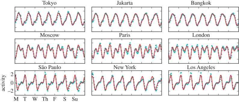
Figure 4.
Modelling the Twitter activity of major urban areas by spectral decomposition (more cities in the electronic supplementary material). Hourly number of tweets during an average week (blue dots) are compared with model results from equation (2.3) (red curves).

