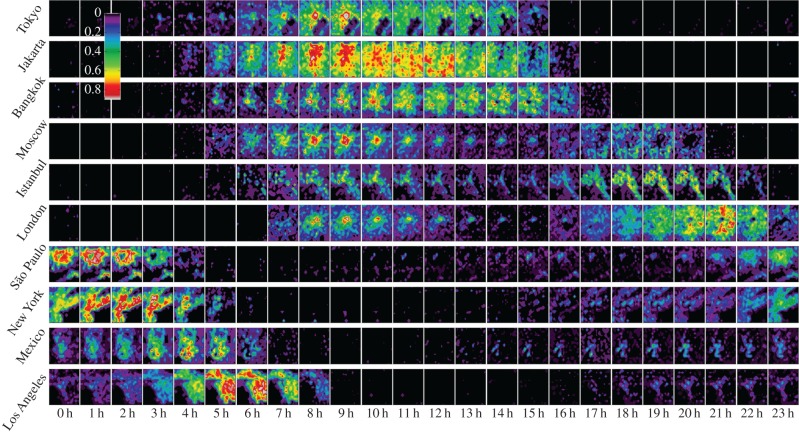
Figure 5.
Spatio-temporal dynamics of Twitter activity in urban areas. Each row shows activity during an average day according to UTC time for the specified city. Colours indicate the normalized excess of activity from the average value at that location (scale shown in figure). Animated visualizations of Twitter activity in urban areas are shown in the electronic supplementary material, videos S2–S4.

