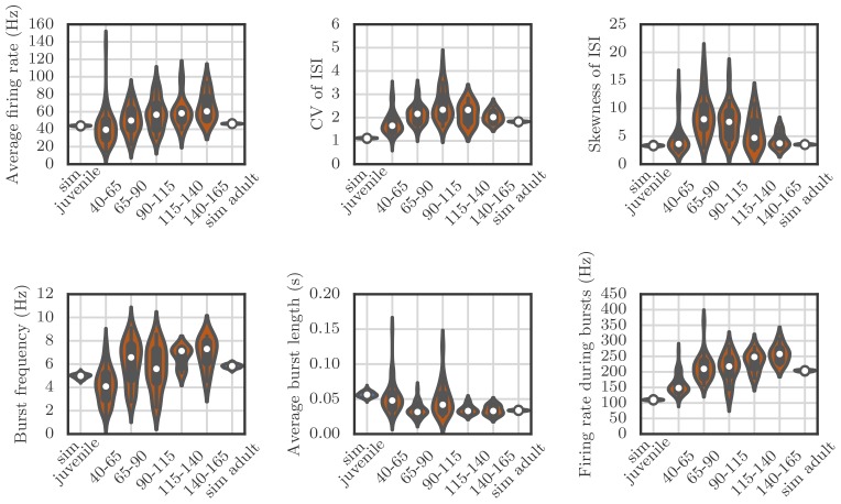
Appendix 1—figure 4. Violin plots showing how the spiking statistics from our simulation compared to the statistics obtained from neural recordings.
Each violin shows a kernel-density estimate of the distribution that a particular summary statistic had in either several runs of a simulation, or in several recordings from behaving birds. The circle and the box within each violin show the median and the interquartile range.

