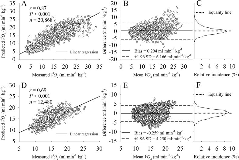
Figure 3. Data were down sampled to 0.1 Hz for a better data visualization.
Graphs (A), (B) and (C) are related to data obtained during activities of daily living (~1200 samples per participant) and graphs (D), (E) and (F) are related to data obtained during pseudorandom walking protocol (1560 samples per participant). (A) and (D): linear correlation of the measured and predicted oxygen uptake ( ) between all participants. (B) and (E): Bland-Altman plot of the predicted and measured
  data. (C) and (F): distribution of the prediction error.

