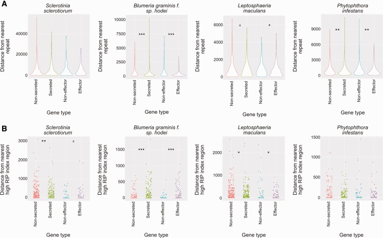
Fig. 7.—
Association of repeat secreted protein and effector-like protein encoding genes with repeat regions and regions with a high RIP index. (a) Violin plots showing distances of secreted and effector-like protein encoding genes compared with random gene sets from each of the genomes tested. Violin plots represent kernel density of the data points. Asterisks and “x”s represent different P values—x = P < 0.1; * = P < 0.05; ** = P < 0.01; and *** = P < 0.001 (Wilcoxon’s test). The y axis scale is distance in bp from the nearest repeat element. Each type of sequence (from left to right: randomized set equivalent in size to secreted protein encoding gene set; secreted protein encoding genes; randomized set equivalent in size to effector-like gene set; effector-like gene set) is colored differently for clarity. Organism names are displayed above plots. (b) Jitter plots showing the same as (a) but for regions with a high RIP index (as predicted by RipCal). Points are staggered horizontally for each gene set so that differences, as statistically evaluated, are easier to interpret.

