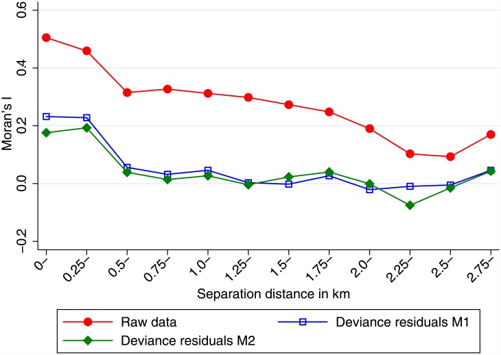
Fig 4. Spatial autocorrelation of T. trichiura infection between and within households in Kyela.
The red line shows Moran’s I of spatial autocorrelation for the raw data. The blue and green lines show the autocorrelation of deviance residuals for the models M1 and M2, respectively. The horizontal axis shows the distance bands between households.

