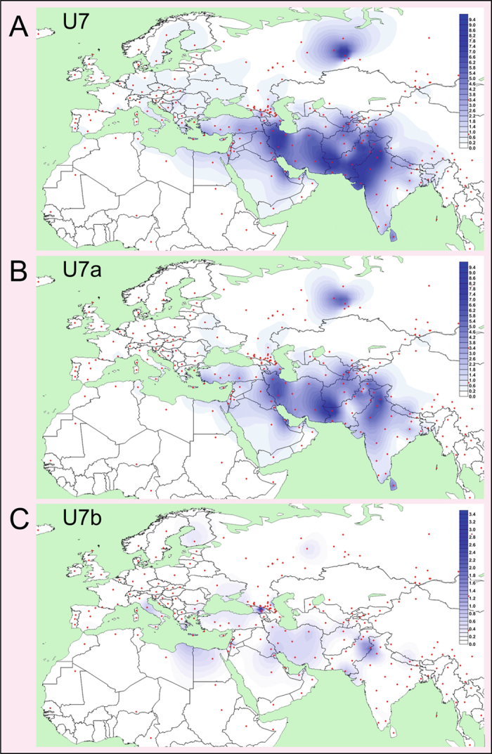
Figure 2. Spatial Frequency Distribution Maps of Haplogroups U7, U7a and U7b.

Dots indicate the geographical locations of the surveyed populations. Population frequencies (%) correspond to those listed in Supplementary Table S3. Note the different frequency scales used in different maps. Maps were generated with Surfer program (version 8, Golden Software, Inc., Golden, CO, USA, https://www.goldensoftware.com/).
