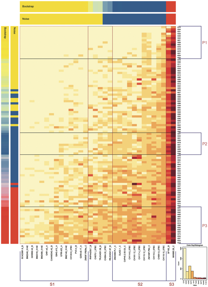
Figure 5. Heat-map analysis of all plasma samples based on k-means clustering.
Transformed natural log data of ID50 values for 98 plasma samples against 32 virus strains are illustrated. In the heat-map, natural log ID50 values for a single plasma are shown by row, while virus strains are displayed by column. Stronger neutralization is represented by darker colors (see key based on log-transformed values). Vertically, the order of the plasma is ranked based on the GMT; the placement of clusters within this ranking is based on the mean titer for all cluster members. Bars with the label “Bootstrap” or “Noise” show the results of statistical analysis of clustering. Both are indicated by mixing the red, yellow and blue colors corresponding to the relative frequencies of matched group assignments. If they have a categorization of 90% or greater consistency, plasma and virus strains are grouped by both the bootstrap and noise tests. Boxes highlight the clusters. Clusters of patient plasma are labeled P1, P2, and P3 (from top to bottom), while clusters of strains are labeled S1, S2, and S3 (from left to right).

