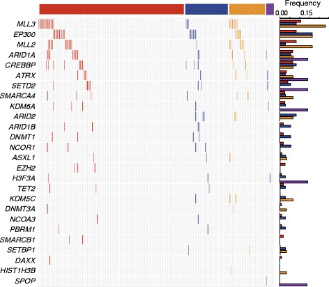
Fig. 2.

Mutated genes involved in the chromatin modification pathway. The heatmap shows the distribution of the mutated genes involved in the chromatin modification pathway across all clinical stages. Each column represents an individual, and each row denotes a gene. The bar graph on the top shows the Stage I, Stage II, Stage III, and Stage IV patient subgroups as red, blue, orange, and purple, respectively. The bar plots on the right side show the mutation frequency of each gene in each clinical stage colored by the stages
