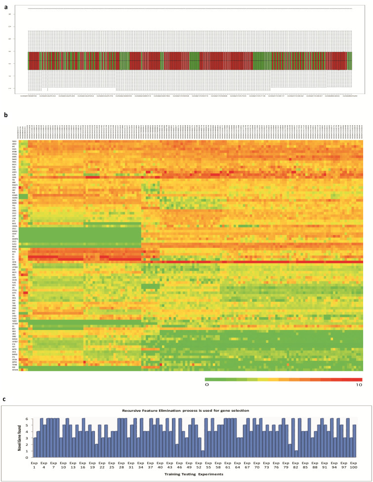
Figure 5.
Robust Gene-Set Identification by Re-sampling Method: (a). Normalized data are represented by a box plot. Here in this graph, the red color represents tumor sample and the green color represents normal sample. (b). The normalized intensity values of our selected 90 target genes, taken from GEO datasets, are represented by a heat map. (c). The abundance of the novel genes found after each re-sampling operation is represented graphically.

