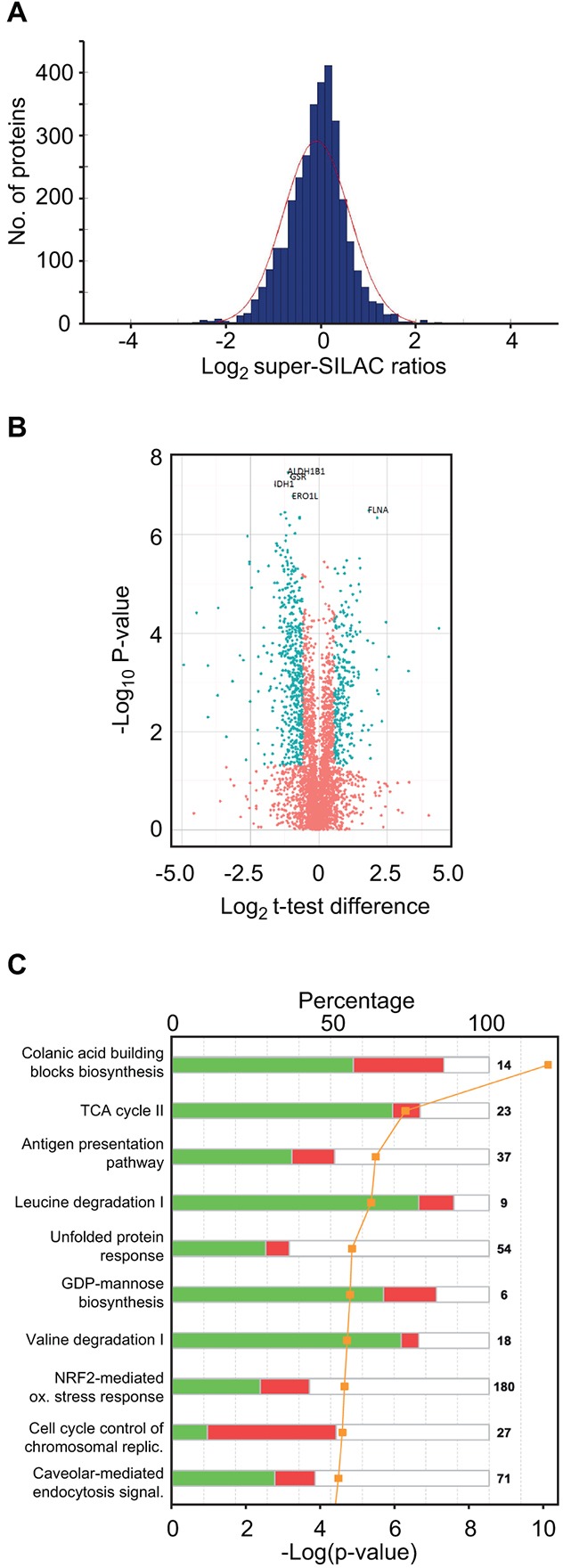
Figure 3. Super-SILAC quantitative profiling and pathway analysis of differentially expressed proteins.

A. Histogram of log2 super-SILAC ratios between proteins in the sPCL and MM samples. Negative values represent proteins with increased expression in MM, whereas positive values represent proteins with increased expression in sPCL. B. Volcano plot of the entire set of proteins quantified during super-SILAC analysis. Each point represents the difference in expression (Log2 t-test difference) between the sPCL and the MM samples plotted against the level of statistical significance. Blue dots represent proteins whose expression is significantly (t-test, p < 0.05) different in the two samples and with an absolute log2 t-test difference >0.58. C. Top 10 canonical pathways [log10 (p-values)] significantly changed in sPCL compared to MM, according to IPA.
