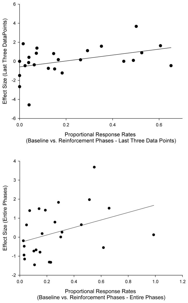
Figure 4.
Scatterplots depicting the relation between effect size and proportional response rates in baseline relative to response rates during reinforcement periods when the entire phases were used (top panel) and when only the last three data points of each phase were used (bottom panel). A line of best fit has been fitted to the data in each case.

