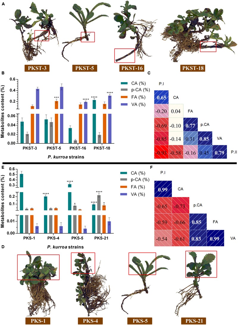
FIGURE 3.

Comparative analysis of intermediate metabolites contents among different tissues of P. kurroa accessions; (A,D) different P. kurroa accessions selected for stolons and shoots, respectively; (B,E) variations in metabolites contents between stolons and shoots, respectively and; (C,F) correlogram showing correlations between tested metabolites and picrosides contents among stolons and shoots, respectively. Correlations are presented in the form of graphs filled in proportion to the Pearson’s correlation coefficient values. Clock-wise occupied with blue color depict positive correlations while anti-clockwise graphs filled with red color indicate negative correlations. The data presented as means ± SD (n = 3). Significance was evaluated within metabolites contents between different accessions (∗p < 0.05, ∗∗∗p < 0.001, ∗∗∗∗p < 0.0001).
