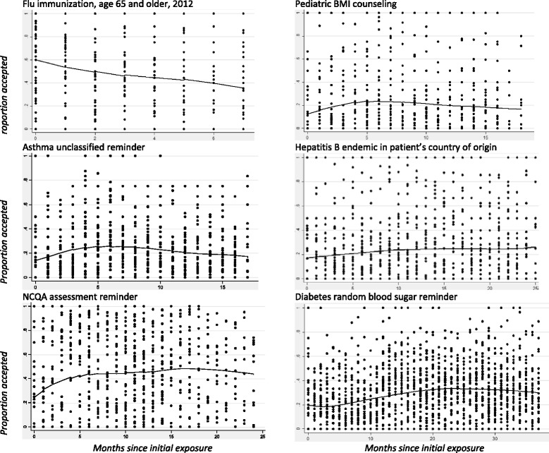
Fig. 1.

The average acceptance rate across clinicians over time for a specified alert show no clear pattern that would suggest desensitization over time, with the potential exception of the flu immunization alert (see text for interpretation). The curves represent the average acceptance rates (lowess smoothed). Each dot represents one clinician’s acceptance rate for the alert during one month; these are displayed to demonstrate that the alerts included in this analysis had different numbers of clinicians and different numbers of months. The zeros on the x-axis indicate the initial month that the alert was deployed
