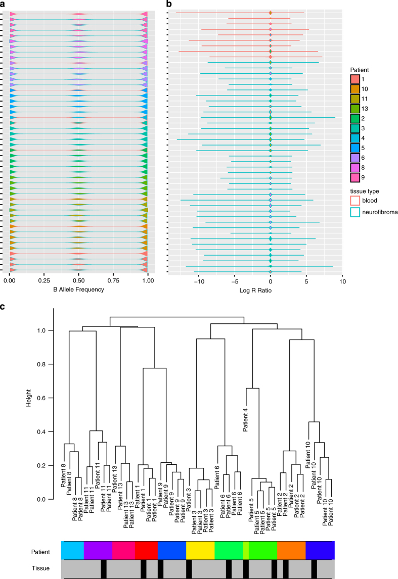
Figure 2. Copy number quality control metrics.
Distribution of SNP array values across samples. Patient samples represented by different colours. Teal outline represents tumour samples while pink outline represents blood. (a) Represents B allele frequencies, (b) represents log R ratio values. (c) Clustering of segmented values, with rows below representing patient samples (colours) and tissue of origin (grey for tumour, black for blood).

