
Fig. 1.
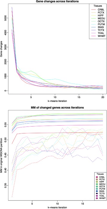
Upper plot shows the evolution of the number of moved genes (y axis) between any pair of modules p i and p j across k-means iterations (x axis) for UKBEC-microarray dataset. Bottom plot shows the average module membership of genes (y axis) moved (dashed line) across iterations (x axis) for the UKBEC-microarray dataset in comparison with average module membership for all the genes (solid line)