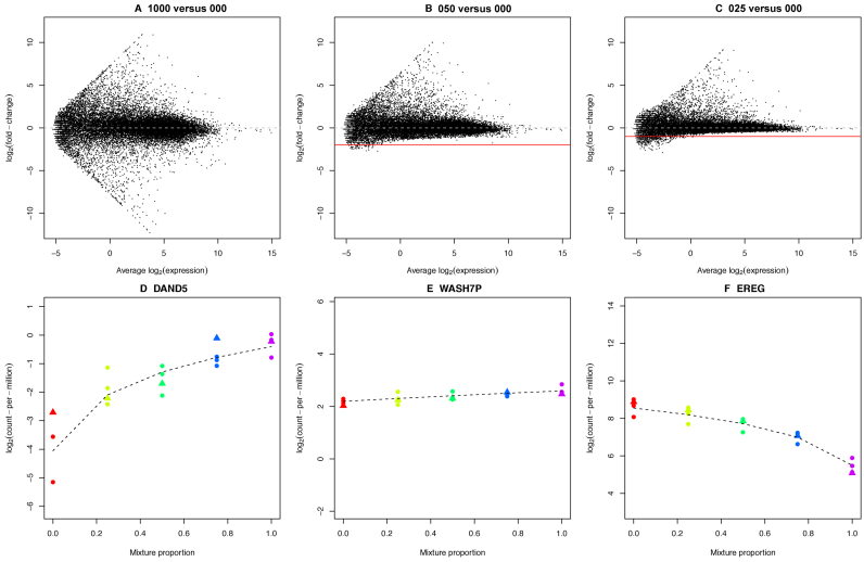
Figure 3.
A view of expression changes across the mixture series. Mean-difference plots between the (A) 100 versus 000, (B) 050 versus 000 and (C) 025 versus 000 samples from the total RNA data set show the attenuation of signal as the RNA samples compared become more similar. These mean-difference plots were obtained from the linear model fits from the voom analysis of the good samples only across the entire series (15 samples). The solid red line shows the theoretical minimum value that should be possible and the dashed grey line represents log-FC=0 (no change in expression). Panels D–F show log-CPM values for three genes across the series. The first (D, DAND5) has higher concentration in the HCC827 sample, the second (E, WASH7P) has approximately equal concentration in each sample and the third (F, EREG) has higher concentration in the NCI-H1975 sample. The dashed black line shows the non-linear model fit (Equation 1) obtained using the ‘good’ samples. Libraries are coloured by mixture proportions, where circles represent good samples and triangles represent degraded samples. The concentration parameters and variability estimated from this model can be used to compare analysis methods and protocols.

