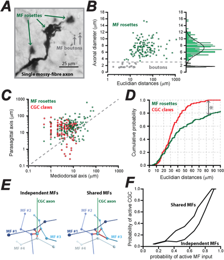
Figure 3. Quantification of MF rosette spacing and comparison with CGC claw spacing.
(A) Image of a single MF axon containing multiple large rosettes (green arrows) and much smaller swellings thought to be MF boutons (grey arrows). (B) Scatter plot of axonal diameter of MF rosettes (green squares) and boutons (grey circles) as a function of Euclidian distance from their nearest neighbour. The histogram on the right of the scatter plot demonstrates how the cut-off for the axonal diameters between rosettes and boutons was determined. The multiple Gaussians that describe the histogram clearly demonstrates the bimodal distribution of axonal diameters. (C) Scatter plot of the mediolateral and parasagittal distance between pairs of MF rosettes (green squares) compared to the superimposed scatter plot of the corresponding distances between dendrite claws on each CGC. The dashed line indicates the location of all equidistant points in each axis. Note how the points in both distributions tend to fall above this line indicating greater spread in the parasagittal axis. (D) Cumulative probability functions’ of the Euclidian distance between adjacent MF rosettes (green line) and CGC claws (red line). We have not included values above 100 μm to emphasise the span of the CGC claws. Note how this analysis predicts that only ~20% of MF rosettes are beyond the reach of two CGC claws. (E) Illustration of the models for independent and shared MFs. The multiple rosettes along a single MF are represented as a single spheres. In the independent MF model shown on the left, a single granule cell with four dendrites (red) that are constrained to be 3.4μm to 27.9 μm in length project in random directions until each dendrite has made contact with one of the randomly placed MFs. However, in this model, each connection must go to an independent MF. On the right single CGC are allowed to receive multiple inputs from a MF as shown for MF #3. (F) A plot of the results from the two simulations illustrated in panel E. Each simulation of the model involved a random spike train that provided input to a given proportion of MFs (probability of active MFs). After running simulations of the model for 100 ms, the output was analysed using MATLAB to compare the output of the network (probability of active CGCs). The results from the two models are shown.

