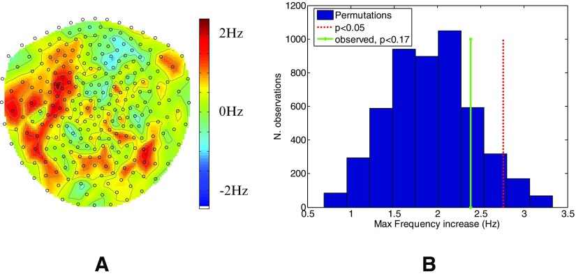
Figure 4.
Change in frequency across channels. Panel (A) shows the mean theta frequency difference (colour scale) between stimulation and sham conditions in each channel across all subjects. The channels to the front of the head are towards the top of the page. The histogram in panel (B) shows the null distribution of this frequency difference (essentially randomly relabeling sham and stim conditions). The red dotted line shows the 95 percentile of this null distribution and the solid green line shows the largest change in frequency actually observed (p < 0.17).

