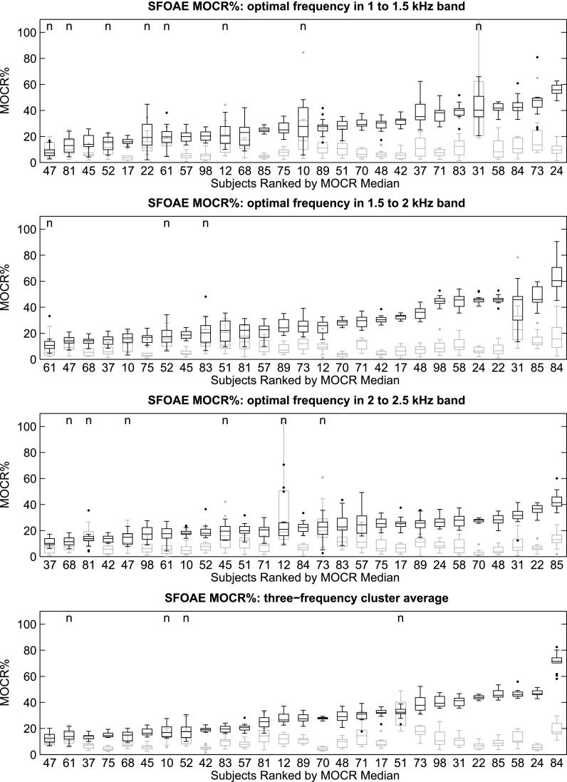
FIG. 2.
MOCRSF distributions for the 27 subjects, represented as box-plots, and ordered by increasing median. From top to bottom: 1 to 1.5 kHz, 1.5 to 2 kHz, 2 to 2.5 kHz, and the three-frequency-cluster average. All subjects provided at least 10 trial pairs of usable data, with most providing 15 trials pairs. The black plots represent the MOCR% distribution (based on the Q-N trial-pairs) and the gray plots are an estimate of the inherent variability in the MOCR measurement (based on the re-paired Q-Q and N-N trial-pairs). The “n” indicates those cases where the MOCR% estimate was not significantly different from the variability.

