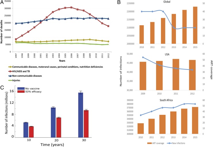
Fig. 1.
(A) Mortality rates in South Africa 1997–2012. HIV-related deaths dropped from 300,000 in 2006 to 153,000 in 2012 coincident with large-scale roll-out of ART (14). (B) Association between new HIV acquisitions and ART coverage. The number of new infections each year (left y axis) is depicted by the blue line. ART coverage (right y axis), depicted by the orange bars, is defined as the number of people living with HIV divided by the number of people receiving ART. A global graph (Top; aidsinfo.unaids.org), graph of the United States (Middle; ref. 15), and graph of South Africa (Bottom; aidsinfo.unaids.org) are shown. (C) Projected number of HIV infections over 10, 20, and 30 y in South Africa. Adapted with permission from ref. 11.

