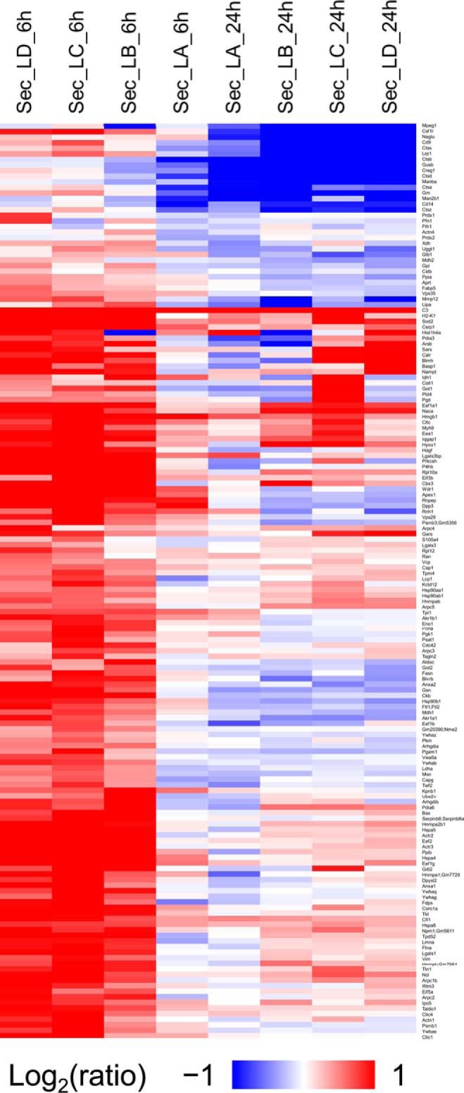
Fig. 3.

Changes in the proteins common to all the data sets. The heatmap represents the hierarchical clustering of the common proteins in the secretome for all the timepoints for the cells treated with LPS. The color key above represents the changes (log2 scale), from dark blue representing the largest decrease, to red representing the largest increase. Cells colored gray represent missing data. Each row is a protein and each column is a sample. Samples are named based on data type, treatment type, time point and replicate as described in “Data analysis”.
