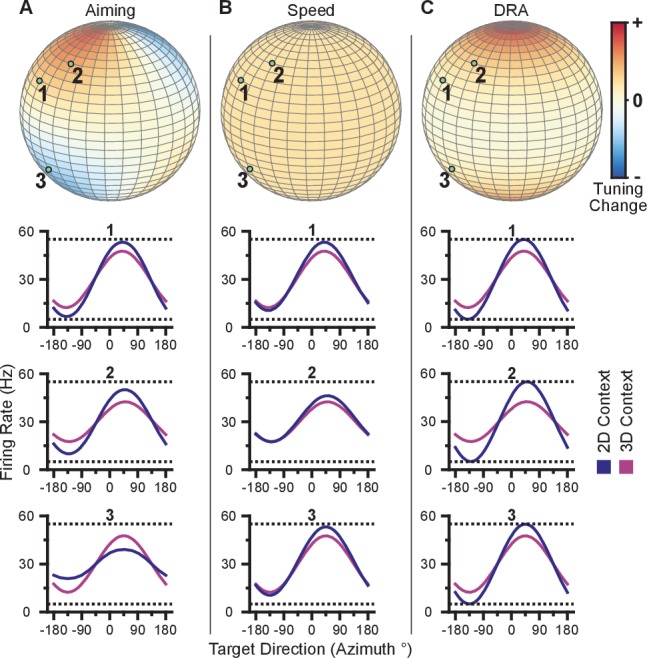
Figure 3. Hypotheses for tuning changes.

(A) Illustration of the re-aiming strategy hypothesis. (B) Illustration of the speed hypothesis. (C) Illustration of the dynamic range adaptation hypothesis. For each hypothesis, the first row shows heat maps of the relative change in tuning range as a function of preferred direction. For illustrative purposes, the heat map in (panel A) is shown as and scaled in the range . The other heat maps are shown as and scaled in the range . The bottom three rows show example changes in tuning functions for three units with preferred directions drawn as the light green points on the heat maps.
