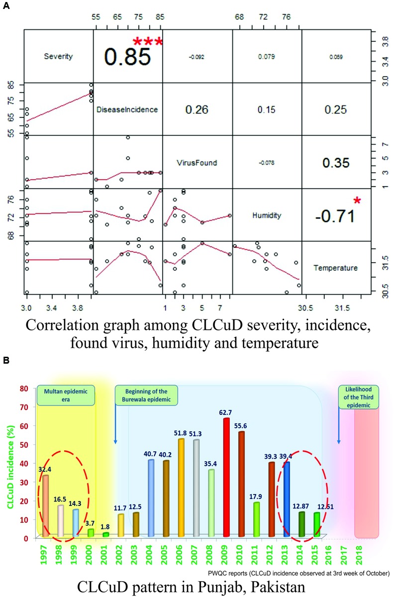
FIGURE 2.

Statistical modeling of CLCuD in Pakistan. (A) The R-Plot represents the correlation structure in between disease severity, disease incidence, virus found, humidity, and temperature. Positive and significant correlations were calculated as numeric values among all the parameters. The numeric values with larger font and positive numbers denote higher correlation strength and vice versa. The significance of each correlation was represented by asterisks, i.e., “∗∗∗” represents very high significance and “∗” represents less significance (P-values <0.01), respectively. All the correlations were also represented in graphical forms (as line segments in red color) and their respective scales are given along x- and y-axis. (B) Graphical bar chart, representing 19 years data (1997–2015) of CLCuD incidence pattern in the Punjab province, Pakistan. The time scale of CLCuD was plotted against the CLCuD incidence (%). Each bar having numeric value and different color (green for least and red for highest incidence) represents the CLCuD incidence (%) in the respective year. The yellow shaded area represents the Multan epidemic era until the year 1999. Whereas, the gray shaded area represents the Burewala epidemic era starting from the year 2002 until 2013–2014. From here on, likely a new epidemic is being evolved (shaded area in pink color). The shaded area in between the epidemics represents the hibernation period of the virus(es). The red dotted circles are highlighting CLCuD incidence scenarios prior to the onset of a new disease outbreak.
