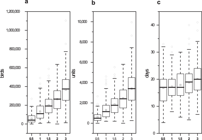
Figure 4. Results of the sensitivity analysis of changes in the contact rates.
The boxplots represent the number of depopulated birds, the number of depopulated units and the outbreak duration with 0.5-, 1, 1.5-, 2- and 3- fold of the contact rates. The squares (◽) represent the means under different conditions.

