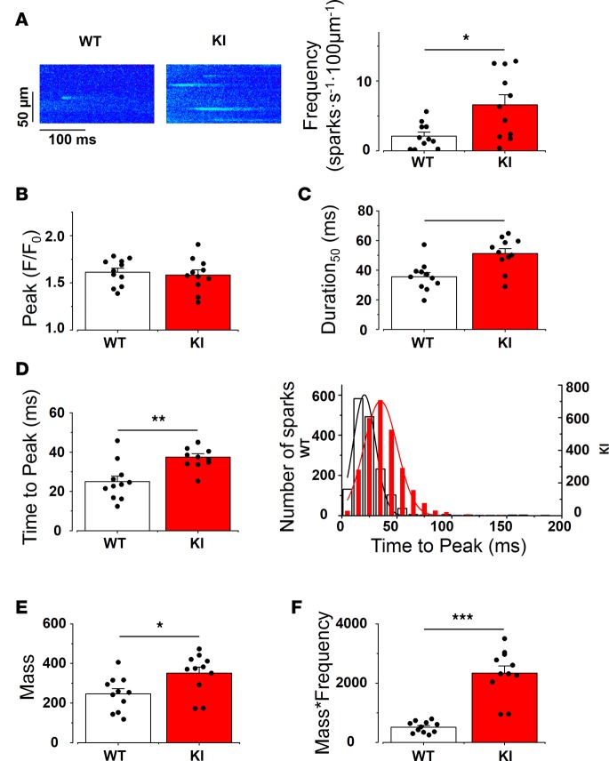
Figure 7. KI SAN cells show enhanced Ca2+ release through Ca2+ sparks.
(A) Left, examples of line-scan images of SAN cells within the intact SAN in WT and KI mice. Right, Ca2+ spark frequency (number of Ca2+ sparks/s/100 μm) recorded from 11 WT and 11 KI SAN cells. At least 4 cells were recorded from each SAN. (B) Ca2+ spark amplitude (measured as peak F/F0 as in Figure 5) (C) Duration of Ca2+ spark at 50% of maximum amplitude is longer in KI SAN cells. (D) Time to peak (the duration between the beginning of the spark and the peak) is longer in KI SAN cells. Bar graph on the left shows the averaged value for the SAN cells. On the right, the histogram shows the Ca2+ spark time-to-peak distribution (WT: bar bars, KI: red bars from a total of 880 Ca2+ sparks in WT and 2,064 Ca2+ sparks in KI SAN cells). (E) Ca2+ spark mass (amplitude × width × duration, indicating the Ca2+ release in each spark) is more in KI SAN cells. (F) Total Ca2+ leak through Ca2+ sparks (Ca2+ spark mass × frequency, indicating the Ca2+ release per second per 100 μm). The bar graph represents the SAN cells mean value ± SEM with individual data on the bar graph. Each value is averaged from all the Ca2+ sparks recorded in cells of the same SAN. White bar represents WT, and red bar represents KI. *P < 0.05; **P < 0.01; ***P < 0.001.

