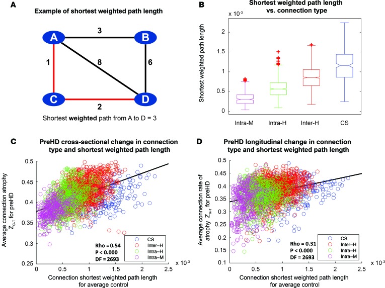
Figure 3. Connection length varies according to connection type and correlates with rate of connection degeneration over 2 years in premanifest Huntington’s Disease (preHD).
(A) Illustration of shortest weighted path length between A and D in an example network. Numbers represent connection weights. When calculating shortest weighted path, length connections are weighted by the inverse of streamline weights, as stronger connections represent shorter paths in graph theory. (B) Comparison of shortest weighted path length for different classes of connection. Intra-M, intramodular (magenta); Intra-H, intrahemispheric (green); Inter-H, interhemispheric (red); CS, cortico-striatal (blue). Lower line, minimum; upper line, maximum; middle-box line, median; lower-box line, 1st quartile; upper-box line: 3rd quartile. Red crosses indicate outliers. (C) Cross-sectional analysis: Z-scores, denoting loss of connection strength, were transformed into positive atrophy measures using a logistic transform. Average transformed connection strength Z-score for preHD participants was plotted against connection-weighted path length for average control, and Spearman rank correlations were performed. Connections are color coded according to type. (D) Longitudinal analysis: Z-scores, denoting connection rate of atrophy over 3 time points, were transformed into a positive rate of atrophy measure using a logistic transform. Average transformed connection rate of change Z-scores for preHD participants were plotted against connection-weighted path length for average control, and Spearman rank correlations were performed. For both C and D, each data point represents a brain connection. The black line represents a least-squares linear regression line. df, degrees of freedom (2,695 data points displayed for each figure).

