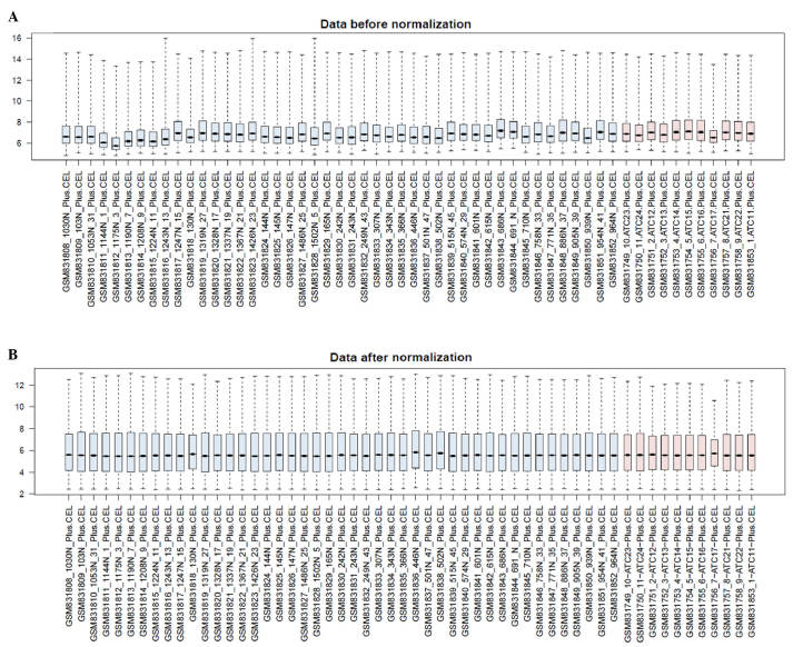
Figure 1.
Box figure of gene expression data prior to and following normalization. (A) Data prior to normalization; (B) Data following normalization. The horizontal axis represents the sample and the vertical axis represents the expression value. Black lines indicate the median values. Blue represents the control samples and red represents the anaplastic thyroid carcinoma samples. The vertical axes represent expression signal values.

