
Fig. 5.

An illustration of the mechanism of selection for outbreak frequency. (A) Two “cities,” numbered 1 and 2, emit infection waves at frequency f1 = 0.625 and f2 = 0.5, respectively. In contrast to our full spatial model, where outbreak frequency is a result of spatial pattern formation and depends on infection rate and infection period, these defined “city areas” simply periodically infect all hosts directly surrounding them. The cities differ only in outbreak frequency and have identical pathogen genotypes, with infection rate β = 3 and infection period τI = 0.3. Colors are gray for susceptible hosts, red and blue for infected and resistant hosts from city 1, and magenta and cyan for infected and resistant hosts from city 2 (t = 7). (B) At t = 75, the waves from city 1, with the higher outbreak frequency, have completely taken over the area between the two cities. The takeover process can be visualized by plotting a horizontal cross section through both cities against time (C). The observed displacement speed can be accurately quantified by 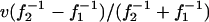 (dashed line), where v is the speed of the infection waves (29). Grid size is 120 × 400 cells.